
Optimizing a peer-to-peer fashion marketplace
About the project:
Brief: Redesign the onboarding and sign-up flow to reduce drop off and drive improved activation and retention.
Total project time: 6 weeks
My role (Contractor): UX research, designer, growth strategist
Background: Curtsy is a peer-to-peer fashion marketplace, where users can shop for brands and items specific to their personal style. Curtsy is a post-seed graduate of Y Combinator with a fast-growing userbase across the South East.
Metrics goals & defining success
20% improvement in onboarding task completion
Improved 30-day retention
Results:
Reduced app-drop off rate during brand selection task and sign-up flow
Increased 30-day retention
Decreased steps in sign-up task flow
Delivered more current, polished UI
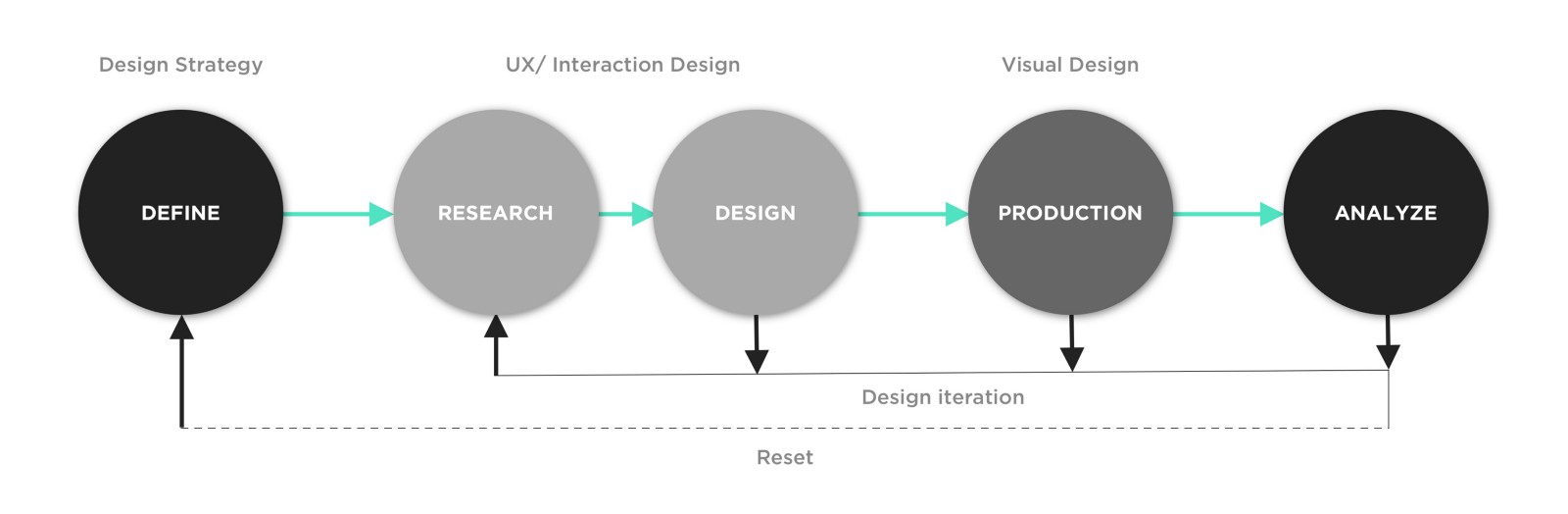
Define
Curtsy is experiencing rapid user growth and wanted to redesign and optimize its onboarding and sign-up experience with the goal to improve activation, engagement and retention. Curty’s product data showed some users were dropping off before completing the account creation process, indicating a problem with the app’s first time user experience.
“Around 81% of users say an app has to make a good first impression in order for them to continue using it, while 56% of users haven’t signed up for an app because the registration process was too long or confusing. ”

Original first time user experience lacked value clear proposition and featured a lengthy account set up process.
Research
Conducting thorough competitive analysis helped us collect and compare data about products in the fashion consignment and reselling market. Using this research method highlighted Curty’s strengths and weaknesses against competitive products and helped inform our design strategy for the new onboarding and sign-up experience. We reviewed products for user demographics, product features, visual design language and voice, language, and content.
Findings:
Competitive products communicate a clear value proposition before account creation
Competitive products request notifications be enabled after value proposition established and account creation complete
Competitive products do not offer sign-up with mobile number, but all allow social sign-up as primary CTA and email sign-ups as secondary
Most competitive products make onboarding skippable to first time users
Competitive products almost all make use of an onboarding carousel to explain value proposition and app’s intended use
User Testing and Data Synthesis
To understand why users were struggling with Curty’s onboarding, sign-up and account set up tasks, we conducted seven usability tests, including questions about users’ apparel buying habits, openness to upcycling and concerns about buying and selling recycled apparel online.
Users were given the following tasks to complete for testing:
Open Curtsy and complete the sign-up process choosing your preferred option
Complete the account set up steps by selecting brands you like
Select your sizing for pants, dresses, shoes and tops
Navigate to the marketplace where you can search for items to buy or upload an item to sell

Using the “space, saturate and group” method, we created an affinity map to synthesize the user testing data, continuing the problem-defining process while beginning to develop potential ideas for solutions.

The 2x2 diagram above helped us prioritise the user painpoints to solve in our new onboarding and sign up designs, evaluating each by the highest possible impact to both the business and user goals.
Product Design Goals:
Goal 1: Make value proposition and benefits clear in least number of screens.
Using a benefits-focused onboarding approach, our design must explain what Curtsy does and the value it will provide the user.
Goal 2: Drive users to explore their personalized Curtsy Marketplace where they can shop for items or upload items to sell.
User onboarding must help convert new users into regular users quickly and minimize the number of users lost during account creation. Making it quicker and easier to select brands and sizes will drive more users towards the marketplace and the item-upload experience, a key step in retaining Curtsy users.
User Flow
In most consumer experiences, onboarding is usually one-size-fits-all, but in assessing the user flow for Curtsy we considered two possible flows, where users could be split into customized onboarding for either buying or selling clothing. We believed exploring this option might better serve Curtsy as a marketplace, with some users primarily engaged in selling goods rather than shopping.

Ultimately we decided there were inherent risks associated with splitting user onboarding at this stage of the company’s growth and that retaining a unified user flow (Version 1 above) for onboarding and sign-up was the best approach for activation and retention by encouraging all new users to explore both sides of the marketplace.
Final Design
Highlighting user benefits
Communicating a clear value proposition for the Curtsy marketplace was a design requirement made clear from our user testing. The UX writing in our new design quickly explains why a user should try Curtsy and the benefits of the app for both buying, selling and joining other users on the Curtsy platform.

Buttons: using familiarity to guide users
In updating the UI of Curtsy’s sign-up buttons, we used color and contrast to guide users towards taking meaningful action. Facebook sign-up is the preferred method of activating users, but in the original design the buttons were not aligned with Facebook’s design guidelines and did not register as a typical Facebook sign-up button. By simply making this button more familiar and consistent with mobile patterns new users encounter, we reduced interaction cost, sped up the user journey and delivered a more predictable and familiar sign-up experience from the outset.
Users told us the phone number sign-up seemed confusing, but due to design constraints this sign-up option had to remain part of the new design. By using contrast and designing this as a clear secondary button, we tried to mitigate the risk of new users clicking away from the app during onboarding.

Updating form fields and user avatar
Like any other element of a user interface, avatars serve a clear functional purpose — they simplify the process of interaction and communication, and humanize the product experience. Curtsy’s users are overwhelmingly college women, aged 18-21, so in designing a placeholder avatar we opted for a single-stroke illustration that might generate an affinity with the userbase and encourage new users to add their profile picture upon signing up.
We also simplified the form fields for sign up to reduce interaction cost where we could and updated the field labels with a cleaner, more current design. Adding the Curtsy logo to drive brand affinity on these screens was another design decision made for this updated experience.
Setting push notifications for marketplace updates
When it comes to requesting permission for sending notifications, the worst thing an app can do is to ask users for permission without any explanation. In the new onboarding and sign-up design, users are greeted with the benefits of using Curtsy first and then asked to allow notifications after proceeding with sign-up. The placement of the notifications opt-in now comes after users have been primed on Curtsy’s value proposition, making opt-in more likely.

Similarly, in leveraging UX writing to guide users along the account set-up path, our Thank You screen explains why users should follow the next steps for an improved and personalize marketplace experience.
Contemporary illustrations
Current design trends favor minimalist, eye-pleasing simplicity so in leveraging this “less-is-more” style we opted for the use of single-stroke illustrated icons where we could, to balance the use of images during onboarding and account set up.

Reducing interaction costs in personalizing first-time-user-experience
Interaction cost is a direct measure of usability and a key painpoint we wanted to address in this part of the onboarding user journey. In the original Curtsy design, users were overwhelmed by the brand and size selection process, which featured both horizontal and vertical scrolling and presented more sizing options than users had the patience to think through.
To address this our new design included the following:
Progress indicator: this UI element shows users where they are in account set-up process so they aren’t left wondering how many more steps lay ahead. We know progress indicators have a strong impact on onboarding completion metrics and improve engagement, with their roots in gamification patterns.
Removing horizontal scrolling: hiding content off-screen was increasing cognitive load and overwhelming users at this critical step. By simplifying the interaction here to allow for only vertical scrolling, the new design enables faster task completion with lower interaction cost.
Make buttons look like buttons: for sizing selection we needed to user appropriate visual signifiers (size, shape and color) to improve affordances in the new Curtsy interface. Using ghost and filled buttons with rounded corners allowed us to better convey “tappability” which was lacking in the original design.

Skip a step or the whole thing
In designing the account set up experience we recognized that not all users would have the motivation to complete all steps and some users may only want to sell items on Curtsy and not shop at all. For this reason we decided the sizing and brand selection steps should be partially and fully skippable for first-time users. If these steps were incomplete, we reasoned it would be possible to re-engage users later with either notifications or email communications to complete the process.

In review:
When designing for growth, we don’t have to reinvent the wheel. The existing user flow worked well but simply needed to be fleshed out and made more engaging
Onboarding and sign-up flows offer a tremendous opportunity to get things right. Distilling the app’s benefits and making account creation quick and action-oriented can have a big impact on task-completion and user retention.