
Ongo: The Run Experience for iOS
Improving content discoverability and program customization
Brief: Redesign Ongo’s onboarding and home feed experience to deliver personalized content recommendations to users that support their running goals
Total project time: 7 weeks
My role: UX research lead, UX/UI designer, growth strategist
Problem Statement
The Ongo platform gives health and wellness creators, like The Run Experience (TRE), the ability to publish their own native iOS and Android apps, manage membership-based communities and generate subscription revenue.
While TRE’s iOS running community was growing quickly, user surveys and customer feedback revealed the following:
Users were struggling to find all relevant content in the TRE library and others didn’t know where to start or what program to try next.
A percentage of new users were abandoning the app before completing sign-up, never landing in the app to see test its value


Project Hypotheses
If users pick interesting topics in onboarding, we can deliver smarter content recommendations and display more relevant and customized content
If we communicate a clearer value proposition in onboarding, we will improve sign-up completion and improve conversion metrics.
Mapping New User Flow
I initially proposed an onboarding and sign-up flow that would branch users into those with a higher assumed motivation level (weight loss, training for a race) and users who were more interested in either ad-hoc workouts or training programs. In descoping the project for V1, we chose to implement topics to follow and design new content blocks for the home screen. Below shows the initial flow and areas where we simplified.
Onboarding
Based on feedback from data science, we added a value prop slider to onboarding and gave the UI a refresh with pill buttons and full bleed images.

Because TRE content was already being tagged in the CMS backend of the app, giving users a way to tag themselves and match with more relevant content was a step we could take immediately towards surfacing the right content for the right users. Users’ goals, experience level and favorite topics will now deliver more customized content to the home feed and library.

New Home With Smarter Content
Our new home experienced utilized horizontal scrolling, which takes more time to plan out than vertical scrolling, but invites the user to thumb-browse quickly, reduces the chance of overwhelming users by several screens worth of horizontal scrolling and it simply a more trend-oriented design pattern.

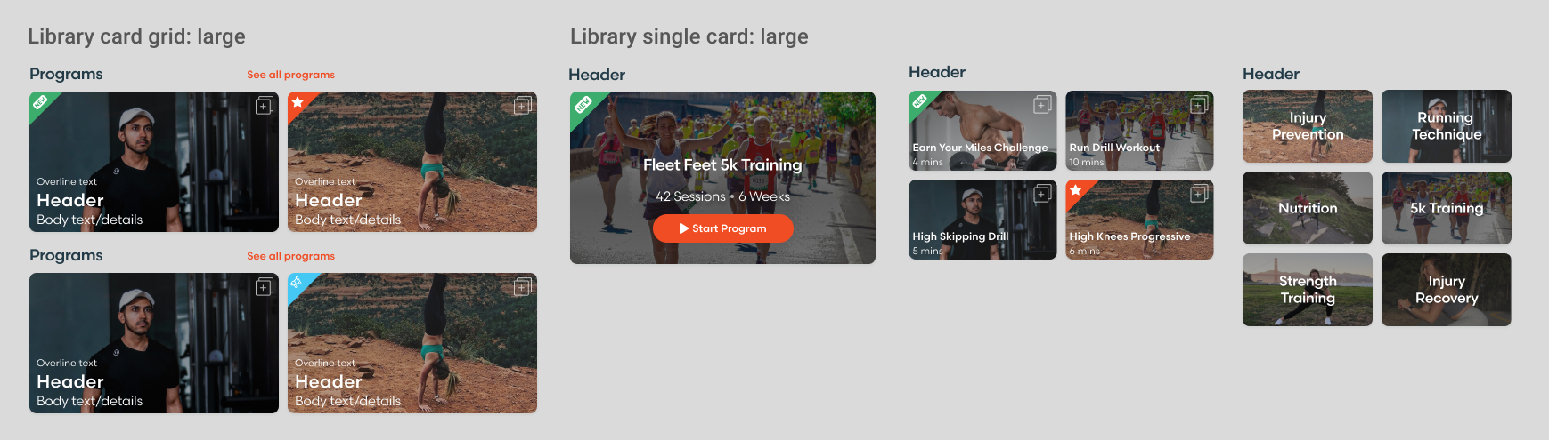
Content Library
Removing the navigation tabs and replacing them with horizontal scrolling simplified the library UI, reducing taps and allowing for all content to be browsed in one place. Additionally, we found users were rarely using the search and filter feature, so

Design System Thinking
One of the team goals for this project was a design language and reusable components that would increase our design and development velocity. By incorporating the findings from user research into component designs I was able to help reduce the time spent reinventing the wheel on new design patterns and deliver a family of card component designs with the flexibility to support Creator apps across verticals.

Results
Product-market fit: 52% (up from 38%) of users said they would feel very disappointed if they could no longer use the TRE app
Conversion to premium: Increased conversion to paid subscription from 3.6% to 3.9% after 7-day trial